Journal
Complementary Colors in Cinematography Without the Cliché
Use opposing color families to guide attention, controlling saturation, proportion and skin tones instead of applying a uniform teal-and-orange look.
Refsee ·
Complementary color schemes use colors that sit opposite one another on a chosen color wheel. In cinematography, the practical idea is to create separation through opposing color families. The exact pair depends on the color model and the image, so “complementary” should not be treated as a single numerical recipe.
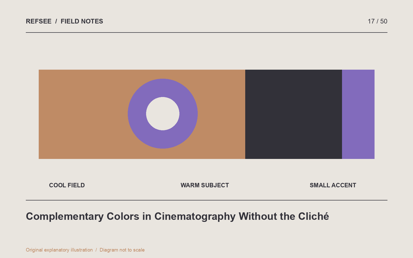
Choose the subject of the contrast
Decide what should separate from what. A warm face against a cooler room is one possibility. A violet costume against a yellow-green environment is another. The combination should help the audience locate the important element or understand two different worlds.
Start with a neutral version of the scene. If the framing and light hierarchy are unclear, opposing hues will not solve the underlying problem. Color contrast works best when it supports an existing structure.
Use unequal proportions
Equal areas of equally saturated opposing colors can compete aggressively. Try a broad, restrained background family and a smaller, stronger accent. The image can feel colorful without every surface demanding attention.
For a product shot, a muted blue background might support a small warm label. For a portrait, cool surroundings can coexist with natural skin rather than pushing every highlight orange. Keep a neutral reference available while grading so adaptation does not make an excessive treatment seem normal.
Build the relationship on set
Use location, wardrobe and props to establish color families before lighting and grading. A carefully chosen coat may provide cleaner separation than trying to isolate a moving subject in post. Test the combination under the actual source, because a material's appearance can change substantially with illumination.
Watch nearby reflections and colored spill. A saturated wall close to the face can tint the shadow side. That may be desirable, but it is a physical part of the scene rather than a purely graphic choice.
Compare saturation, not just hue
Make three test versions: restrained throughout, saturated accent only, and saturated background plus accent. View them small and at normal brightness. Which one directs attention most clearly? Which one preserves believable skin or product color?
Save the chosen relationship with a short note about proportion and intensity. “Cool, low-saturation room with a warm practical and neutral skin” gives a collaborator more guidance than “teal and orange,” and leaves room for a distinctive image.