Journal
Build a Color Palette from Film References
Extract a usable film palette by separating dominant colors, accents, skin tones and lighting conditions instead of copying every sampled pixel.
Refsee ·
A film color palette is a set of relationships, not merely a row of attractive swatches. Large surfaces, small props, skin, light and shadow all occupy different roles. Sampling five pixels from a reference frame can start the conversation, but it does not explain how to reproduce the visual balance.
Choose references from the same visual intention
Begin with a small group of frames that share a mood and lighting logic. A sunlit exterior and a tungsten interior may both contain green, but those greens operate differently. Separate day, night or location families if the project needs distinct worlds.
Write down what attracts you before using an eyedropper. It might be muted walls around warm skin, a tiny red object inside a cool scene, or a narrow range of earthy colors. That relationship is more transferable than an exact hex value.
Assign roles and proportions
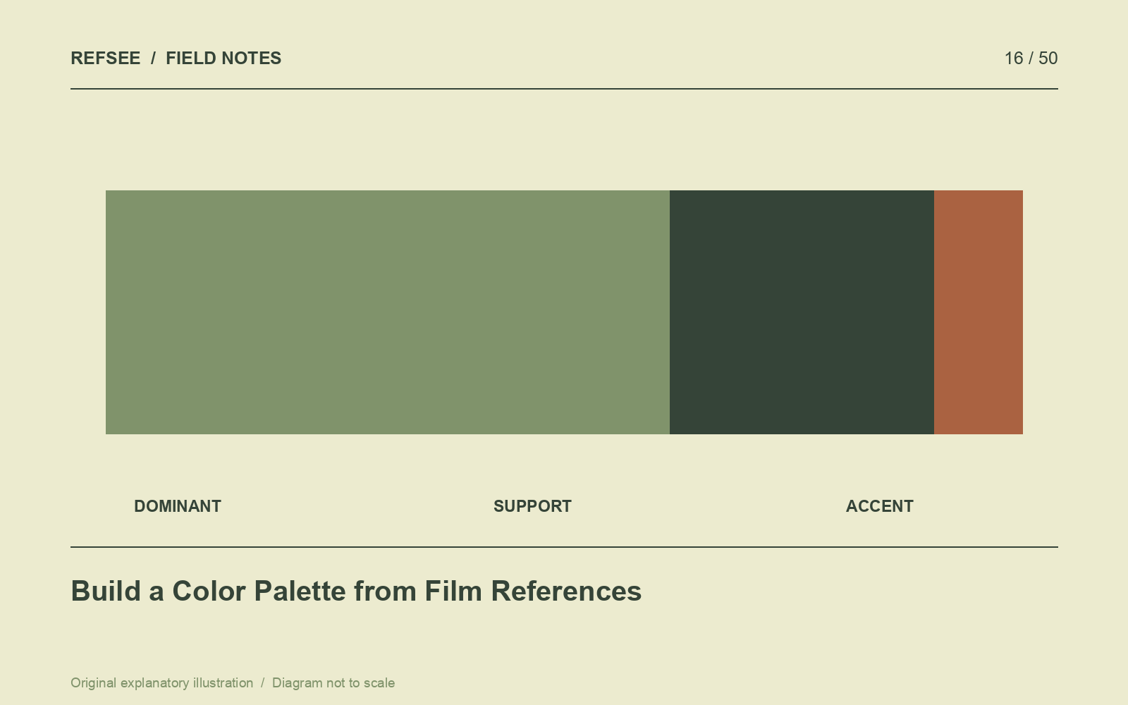
Create swatches for dominant, supporting and accent colors. Add neutrals and a note about skin rendering. Describe the approximate visual balance in words: “large desaturated green surfaces, warm human tones, occasional saturated red.” Avoid treating all swatches as equally important.
A palette can fail when a successful accent becomes the color of an entire wall. Scale changes the effect. Test the palette on a simple layout or location photo so the colors occupy something like their intended proportions.
Separate design color from light color
A blue wall under warm light is not equivalent to a neutral wall under blue light. Materials reflect sources differently, and grading cannot always separate elements that were recorded with similar values. Decide which colors come from wardrobe, set surfaces, practical lamps and the final grade.
Photograph fabric and paint samples under the intended lighting. Include skin or a stand-in where possible. Screens, printouts and physical materials can disagree, so a palette should be tested in the camera pipeline that will make the film.
Turn the palette into department notes
For art direction, specify surface families and finish. For wardrobe, identify colors that should blend or separate. For lighting, describe the relationship between sources. For the colorist, provide reference frames with a note explaining which qualities matter.
End with an exclusion list: colors or combinations that break the world. A useful palette provides both freedom within the system and a clear reason to reject an attractive object that belongs to a different film.