Journal
Product Compositing: Match Perspective, Light and Contact
Integrate a product into a new background by matching viewpoint, light direction, edge quality and contact shadows before adding a final color treatment.
Refsee ·
A product composite combines an object photograph with another environment or background. The result feels convincing when the parts agree about space and light. A global color grade can unify tone, but it cannot fully repair a product photographed from the wrong height or lit from the opposite direction.
Match viewpoint before cutting out the product
Identify the background's horizon, surface angle and implied camera height. Compare how much of the product's top and side should be visible. A bottle photographed from above will not sit naturally in a low-angle environment simply because its outline is clean.
When planning a shoot, select the background first or create a rough perspective guide. Capture the product from the required angle with enough resolution for the final placement. Include a scale reference when proportions relative to the environment matter.
Make the light agree
Determine the dominant light direction, softness and color in the background. Reproduce the important relationship on the product rather than trying to paint every highlight afterward. Reflective objects need an environment that makes sense in their surfaces as well as behind them.
If a product already contains a strong window reflection, place it in a scene where that reflection is plausible or choose another source photograph. Contradictory highlights can reveal a composite even when the shadow looks correct.
Build contact before atmosphere
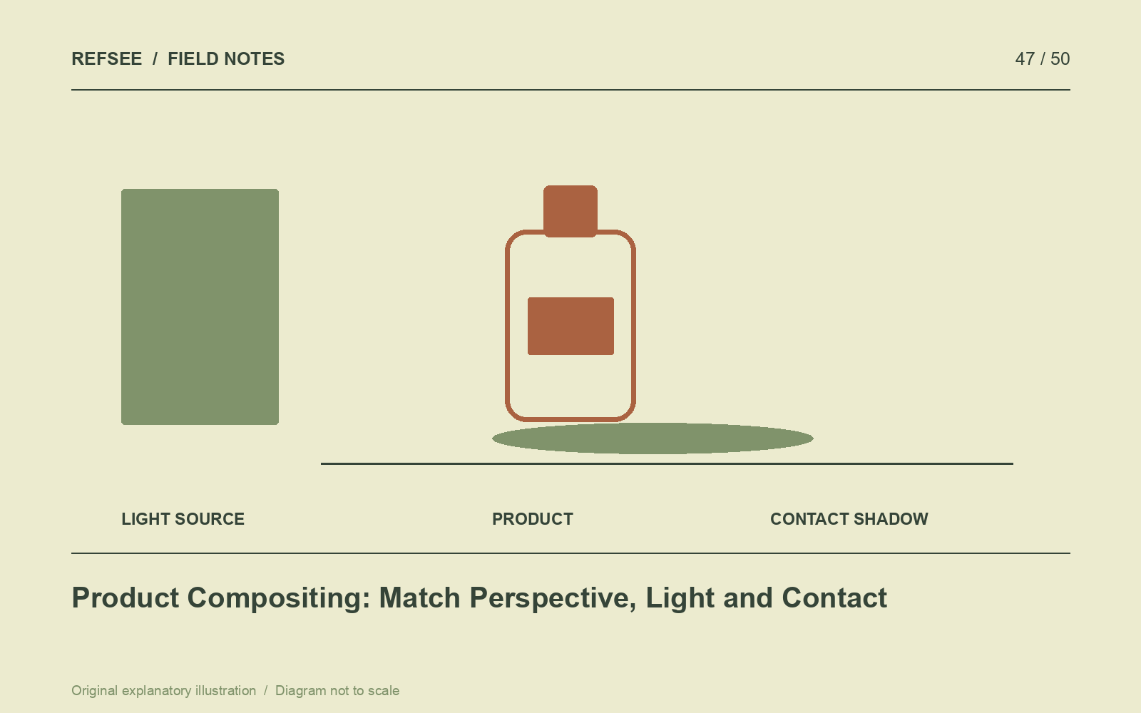
A grounded object usually needs a contact shadow at the point where it meets the surface, plus any broader cast shadow appropriate to the light. The darkest region is often near contact, but its exact character depends on the geometry and illumination.
Check edge quality at the final viewing size. Overly sharp cutouts can look pasted in; excessive feathering creates halos. Preserve transparent and semi-transparent regions with a method suited to the material rather than applying the same mask treatment everywhere.
Finish with a consistency pass
Compare sharpness, depth of field, noise, contrast and color. These should relate to the same imagined capture conditions. Add reflections or environmental color only where the surface would plausibly produce them.
Review product labels, proportions and material appearance against the original. If an AI-generated background is involved, inspect its geometry and light just as carefully as a photographed plate. A believable composite is the result of several compatible decisions, not one dramatic finishing effect.