Journal
Negative Space in Photography: Make Emptiness Do a Job
Use negative space to support gaze, movement, scale and text placement while keeping the image intentional rather than simply leaving part of it empty.
Refsee ·
Negative space is the area around and between the main subjects of an image. It can be a blank wall, open sky, a dark room or a relatively quiet field of texture. It is not necessarily white, featureless or unimportant. In a strong composition, that space changes how the subject is understood.
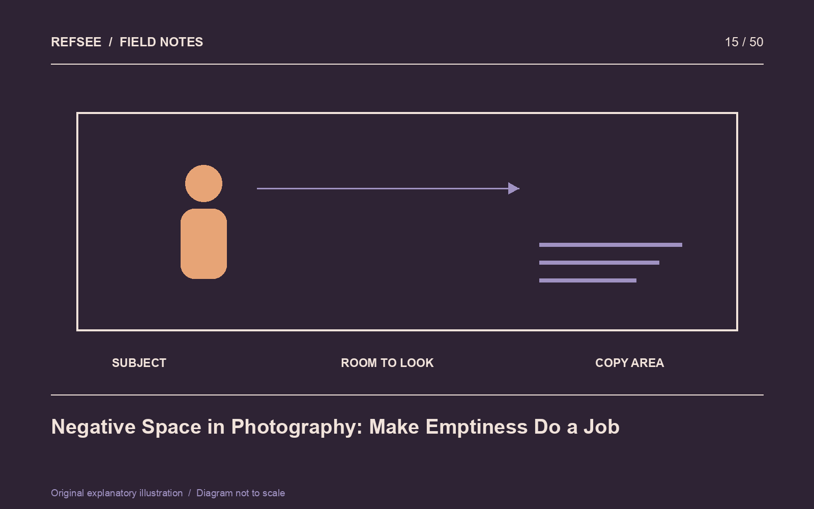
Give the empty area a function
Leave room in the direction someone looks to suggest attention beyond the frame. Leave room ahead of a moving subject to imply a path. Surround a small figure with a large environment to emphasize scale or isolation. These are different jobs and may require different placement.
Try describing the relationship without using “minimal.” For example: “The doorway occupies a small part of a large dark wall, making the entrance feel uncertain.” If you cannot explain what the space contributes, the composition may need another decision.
Control texture and brightness
An area can be unoccupied but still visually loud. A high-contrast cloud, bright crack in a wall or isolated reflection may pull attention away from the subject. Evaluate the negative space at thumbnail size to see whether it really reads as quiet.
Lighting can simplify an area without removing all detail. A wall that falls gently into shadow may provide a more convincing environment than a perfectly uniform backdrop. Preserve enough information for the intended mood.
Plan for text before the shoot
If the image will carry a headline, ask for likely copy length, placement and output formats. Leave usable space rather than a narrow strip that can fit only a few words. Consider contrast behind the letters and how the composition changes on smaller screens.
Make a version with a rough text overlay during the shoot. The overlay does not need final typography; it needs realistic line lengths and a realistic logo size. Check that the image still has a focal point once the copy is present.
Test the opposite crop
Crop tightly around the subject, then compare it with the spacious version. What meaning disappears? If nothing important changes, the negative space may be incidental. If the tighter crop removes a sense of direction, distance or vulnerability, the larger composition has a clear purpose.
Keep both useful versions when the brief allows. A campaign may need the breathing room for one placement and a more concentrated image for another, provided both retain the original visual idea.