Journal
Film Title Design: Typography That Belongs to the Image
Design film titles with readable type, deliberate placement and timing that fits the footage, while checking contrast and delivery crops.
Refsee ·
A title is both language and an image. Its typeface, scale, spacing and duration introduce the film's tone before the viewer has read every word. Start by deciding whether the title should feel like a quiet label, a physical object in the scene or a deliberate graphic interruption.
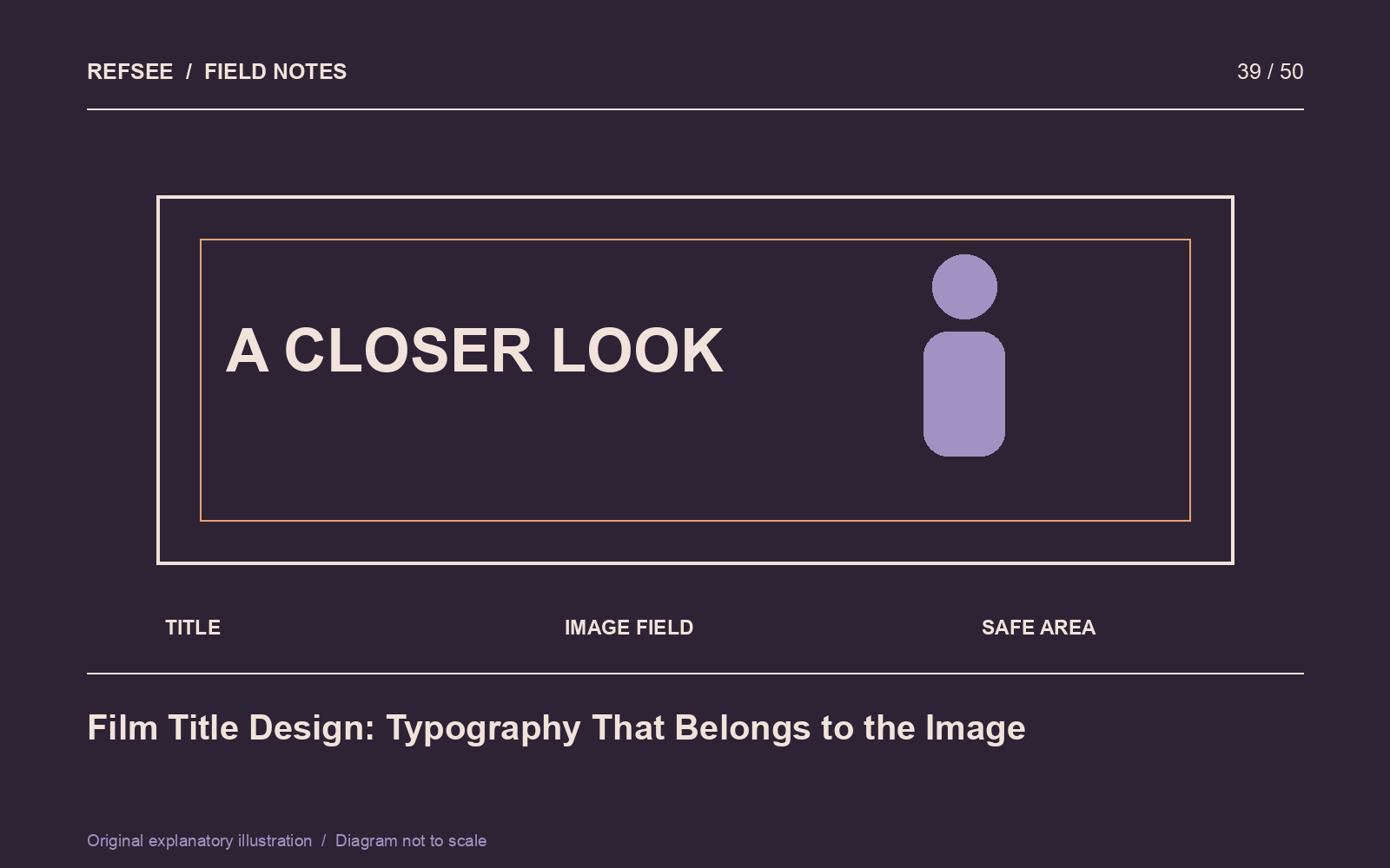
Choose a role before a typeface
Write three qualities that belong to the project, then translate them into observable typographic choices. “Precise, restrained, technical” might suggest controlled spacing and a limited hierarchy. It does not automatically require a futuristic font.
Test the actual title text early. A typeface that looks elegant in a specimen can behave poorly with your letter combinations, long words or required punctuation. Check the font license for the intended use and collaborators' access.
Place the title in a real frame
Use representative footage rather than a plain design canvas. Look at the brightness and texture behind the letters throughout the shot. A title may begin legibly over a dark wall and become unreadable when the camera moves toward a window.
Adjust placement, scale, weight or a restrained backing treatment before adding heavy effects. Keep margins appropriate to the actual delivery specifications and verify alternate crops. A centered title is not automatically safe when the composition changes from horizontal to vertical.
Give reading enough time
Duration depends on wording, complexity, motion and what else the viewer must process. Read the title naturally, then allow a moment for the image to settle. Do not use a single duration for every card regardless of length.
If animating, make the motion support the role. A subtle reveal may suit a reflective opening; a sharp interruption may suit a change of chapter. Avoid a complicated entrance that consumes most of the time available to read.
Check the smallest realistic viewing size
Review the title on a phone and in the final encoded file. Thin strokes, tightly spaced letters and small subtitles can deteriorate after compression. Check credits and legal lines separately from the hero title.
Finally, view the sequence with no sound. Does the typography establish the intended tone on its own? Then restore the audio and check the timing. The best title feels like part of the film's visual language rather than an unrelated template placed over it.